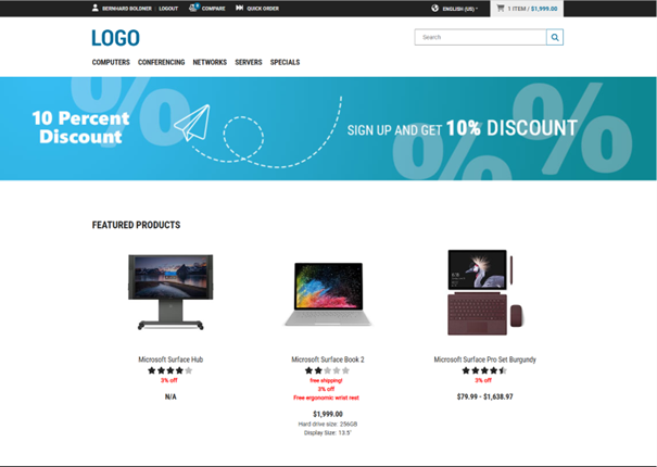
Content Editing
This section covers content editing in the Design View by providing step-by-step instructions and practical use cases.
To help you efficiently manage and update your shop content, you will learn how to update content, such as teaser banners, texts, and images, to reflect seasonal campaigns, product launches, or localized promotions – without needing developer support.
Editing a Component
-
Select the component to be edited:
Hover over the content components and click the Pencil icon (
 ), or click on the component name in the content structure panel to edit a specific component.Note:You can only edit the last (deepest) level of components. For example, if a slider component contains multiple teasers, you can edit the teasers but not the slider container itself.
Managing Images
The image management in the Content Management Center allows you to:
- Upload images
- Browse and search images in all folders
- Manage and assign images to configuration parameters
- Reuse shared folders and images (
 ) from different parent domains
 - Select a folder to browse its images
- Delete images
Uploading Images
To upload an image:
-
Select the component to be edited:
Hover over the content components and click the Pencil icon (), or click on the component name in the content structure panel to edit a specific component.The editing panel is shown.
-
Drag and drop your image or click browse.
You can click on a certain folder to upload your image there.
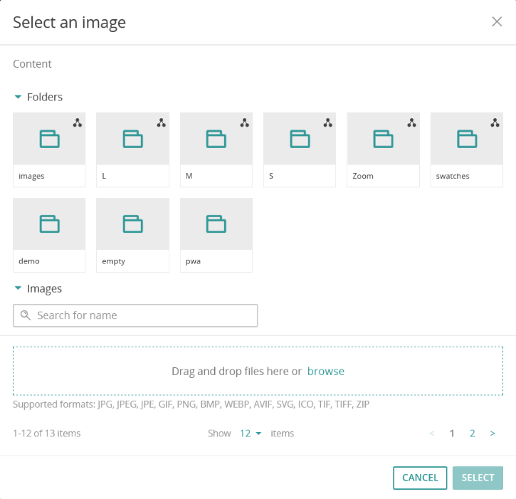 The supported formats are determined by ICM.Note:It is not possible to upload images to folders that are shared. They are marked with a Shared icon ().Uploaded images are immediately available in the chosen folder and can be selected for being assigned to a component.
Deleting Images
Deletion removes the image from all configurations. This means that it will also be removed from all components in which it is used.
It is not possible to delete images that are shared. They are marked with a Shared icon ().
-
Click the Delete icon (
 ) at the image.
This opens a confirmation dialog.
) at the image.
This opens a confirmation dialog.
Use Case: Updating a Teaser Banner
-
Hover over the teaser you want to edit and click the Pencil icon (), or click on the component name in the content structure panel.
-
Click the Save button.
The result may look like this:
Figure 1. Updated teaser banner for an autumn sale 
Moving Components on the Page
Moving components allows you to adjust the layout of your page by changing the order or placement of components. Only certain components can be moved, and visual cues indicate which components are movable.
- Components that can be moved are indicated with a drag handle (
 ).
). - Only the last (deepest) level components in the structure can be moved. Parent or container components cannot be repositioned.
- Components marked with a Lock icon (
 ) are shared assignments from a parent domain and cannot be moved.
-
Open the content structure panel by clicking the first icon (
 ) in the sidebar.
-
Drag and drop the component to the desired position using the drag handle ().
Note:If the Not allowed cursor (
 ) appears when you try to drop the component, you cannot place the component in that location. Try a different position.
Publishing or Hiding Components
Components can either be published or hidden. This allows you to control when and where components are visible to end users. You can temporarily hide content in a specific context or publish it globally across all uses. Managing local and global visibility facilitates content scheduling, testing, and campaign rollouts.
Components can either be published or hidden. The differences are as follows:
- Visibility (Hidden):
Hiding a component affects only the current context (the specific page or location where this component is used). The component remains visible in other contexts where it is assigned.
- Publishing:
Publishing a component has a global effect. It changes the visibility across all pages or contexts where this component is used.
Components display visual cues in the content structure panel:
- Components that are explicitly hidden are grayed out and display an eye icon with a line through it. Example:

- Components that are not visible because they are unpublished or their parent is hidden are grayed out but do not display the eye icon with a line through it. Example:

Publishing Components
To publish a component:
-
Open the content structure panel by clicking the first icon () in the sidebar.
Hiding Components
To hide a component:
-
Open the content structure panel by clicking the first icon () in the sidebar.
-
Hover over the component you want to hide and click the eye icon (
 ) to toggle the visibility.
This hides the component only in the current context.
) to toggle the visibility.
This hides the component only in the current context.
Assigning Components to Customer Segments
Assigning components to customer segments allows you to display tailored content to specific audiences.
-
Select the component to be edited: Hover over the content components and click the Pencil icon (), or click on the component name in the content structure panel to edit a specific component.
Use Case: Reorganizing and Targeting a Promotional Banner
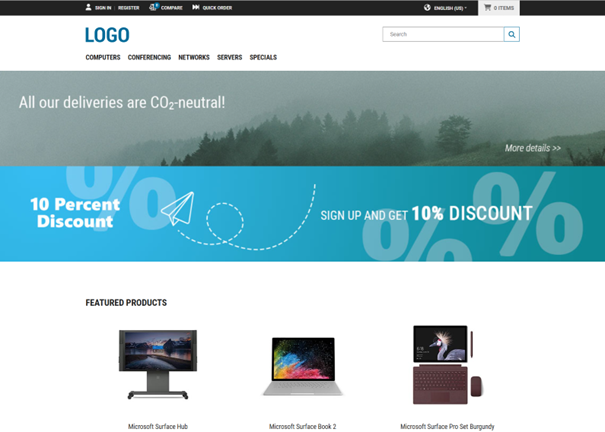
- Move the promotional banner to a more prominent position
- Hide an outdated component temporarily
- Assign the new banner to a specific customer segment
-
Open the content structure panel by clicking the first icon () in the sidebar.
-
Click the eye icon () to toggle the visibility to hidden.
-
Click the Save button.
The result for logged in customers may look like this:
Figure 3. Reorganized and targeted promotional banner